Augusta Health
When it came time to overhaul this regional healthcare provider’s website, Mutti was brought on board to provide thoughtful content strategy and clean, accessible copy.
What We Did
Web content
UX Copy
Content Strategy
About the client
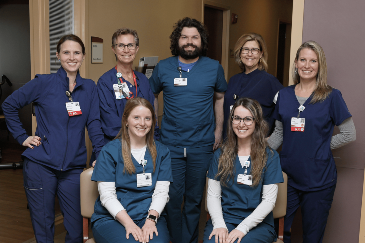
Nestled in Virginia’s beautiful Shenandoah Valley, Augusta Health is among the finest—and first—nonprofit community hospitals in America. With a main hospital campus and dozens of outpatient facilities, their highly trained physicians and staff use state-of-the-art technology to provide top quality care to people throughout the region.
A voice that matches the mission
Goals
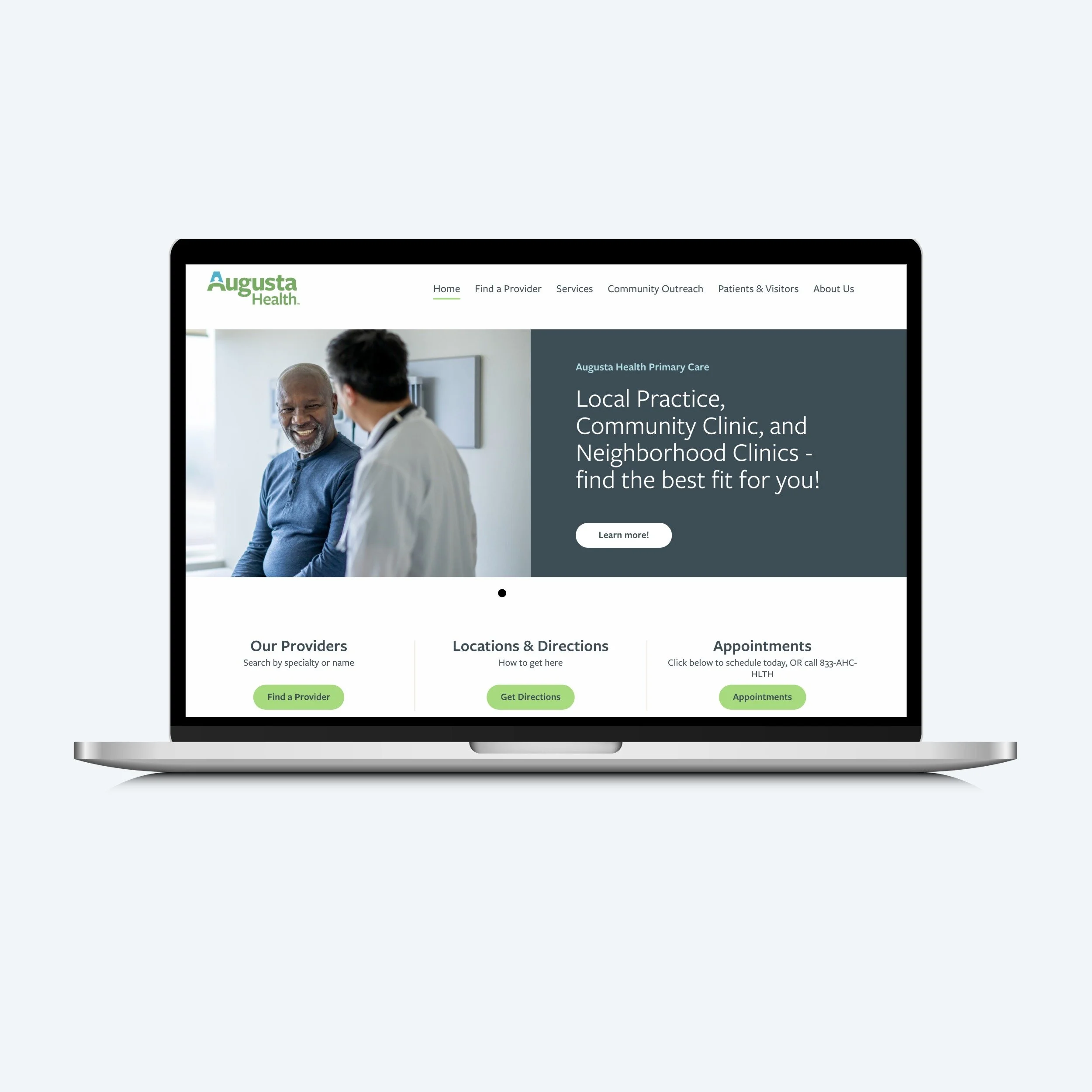
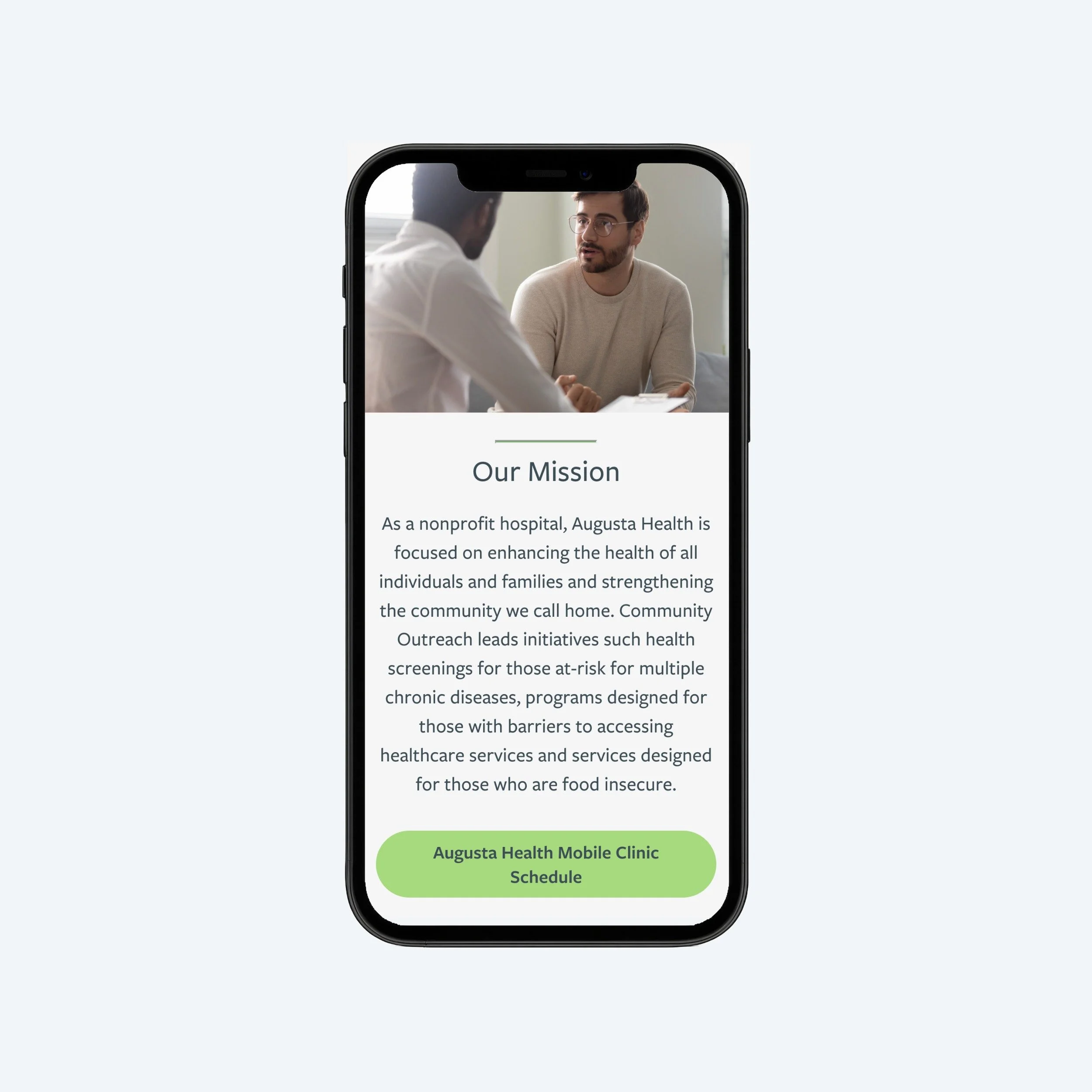
Augusta Health’s mission is “to strengthen the health and well-being of all people in our communities.” To that end, they wanted the copy on their site to be written and organized so that patients can find the information they need as easily as possible. They also wanted it to reflect the combination of world-class care and small-town hospitality that makes them unique.
Content Goals:
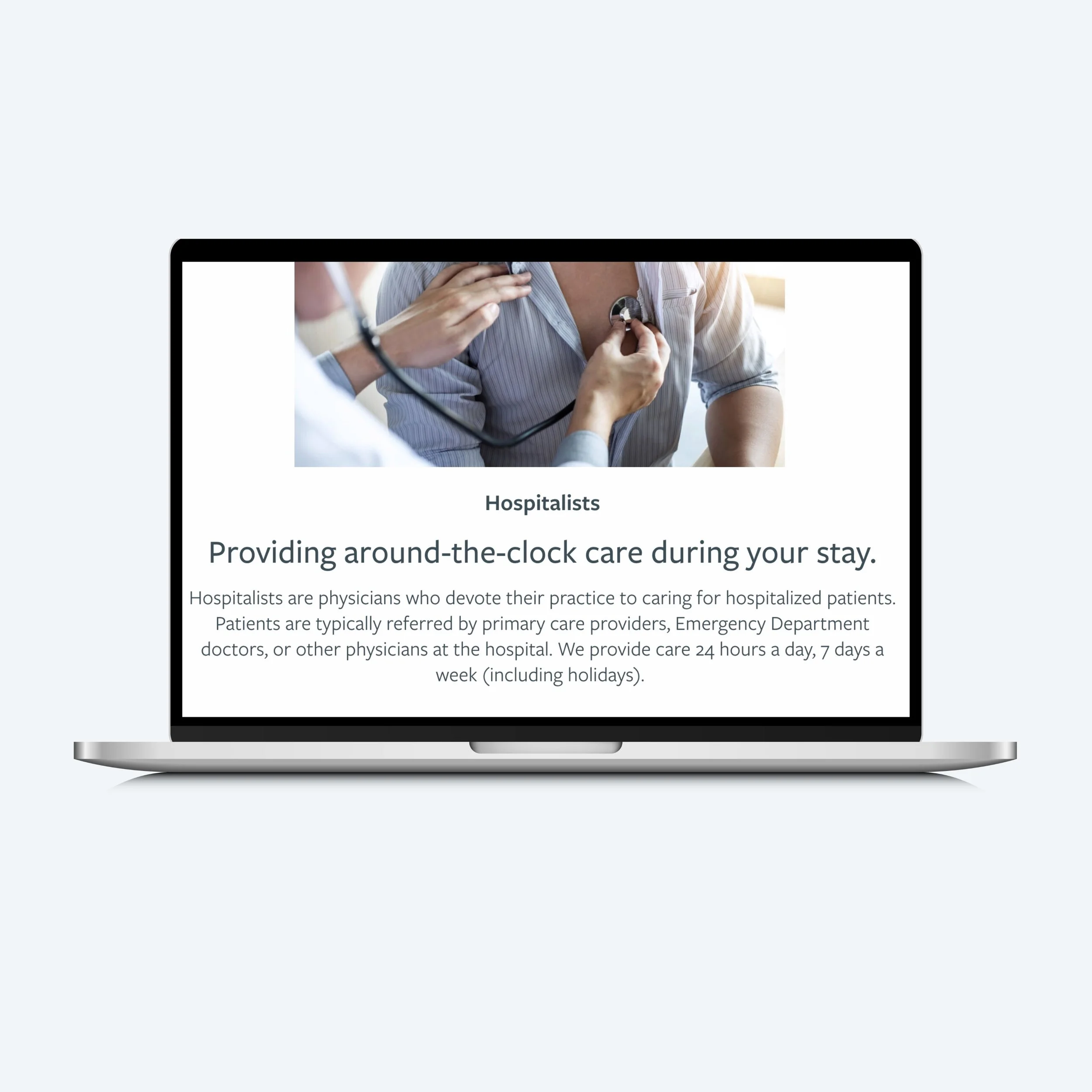
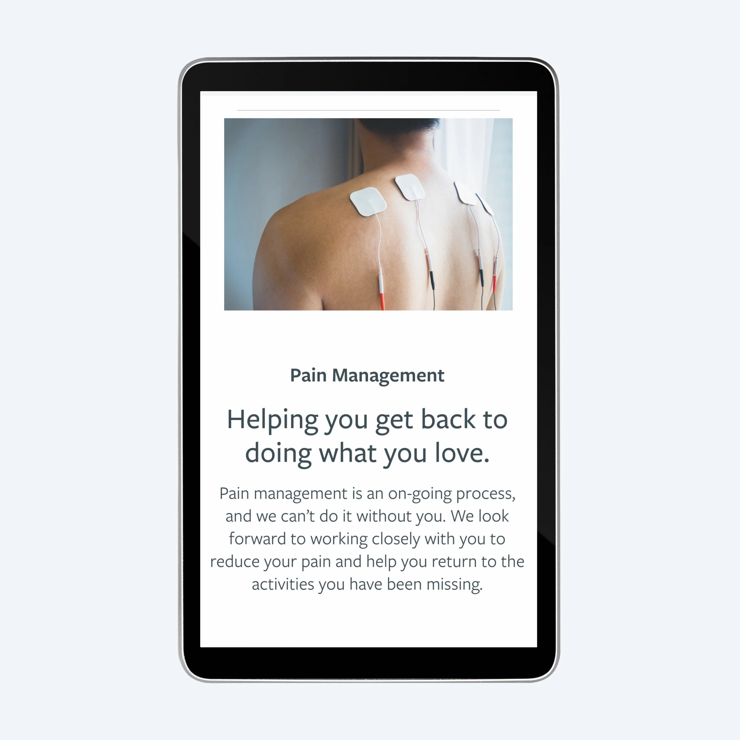
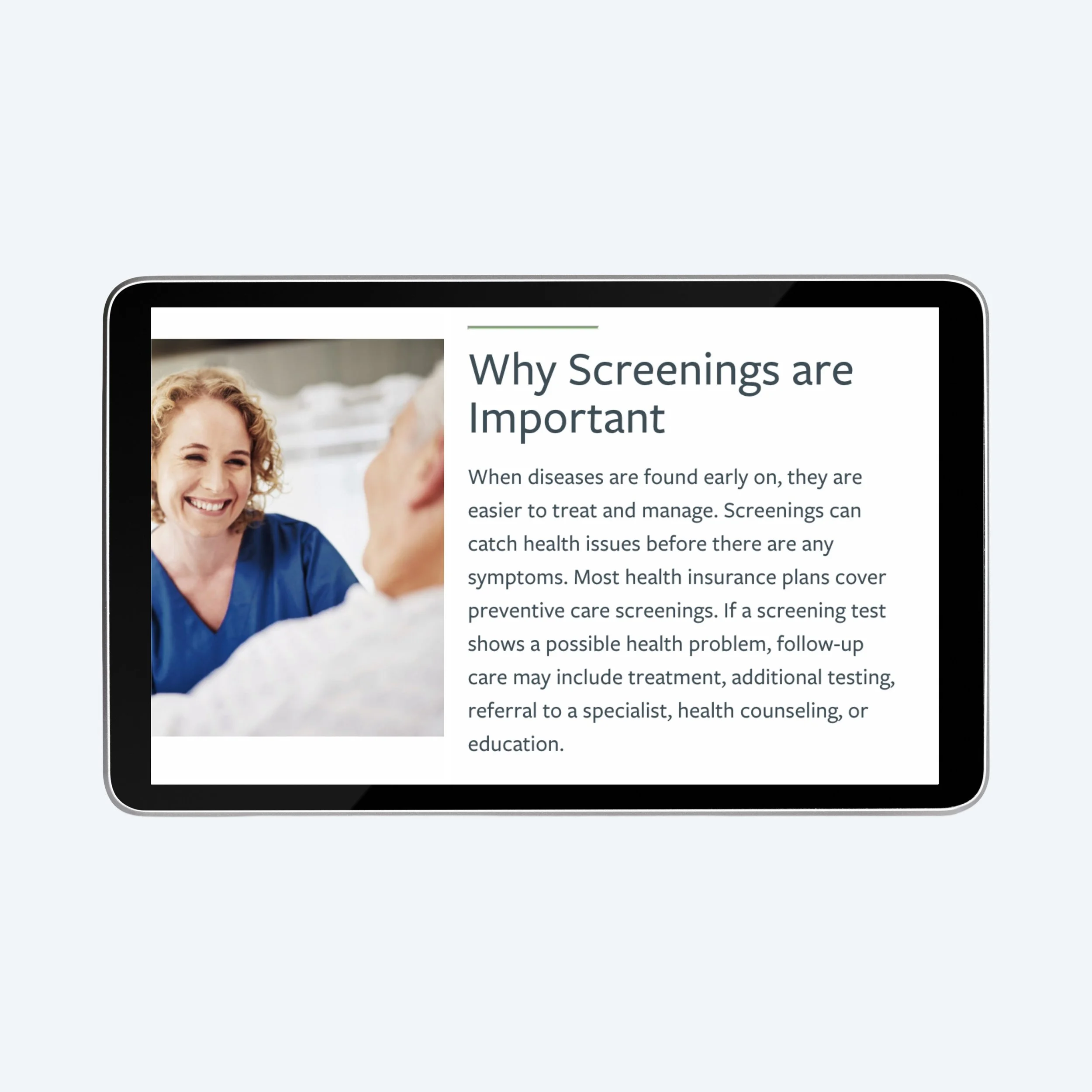
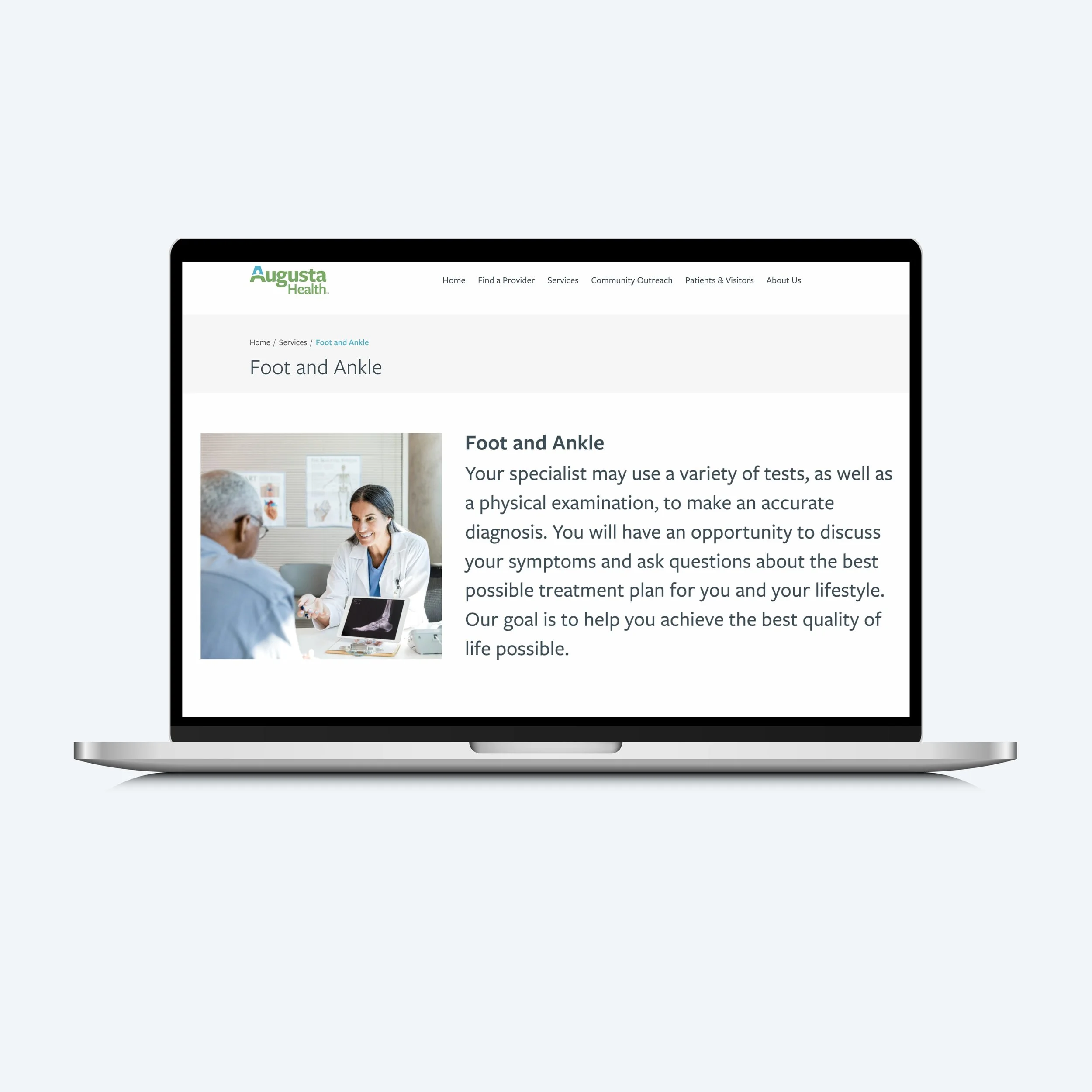
Clear, well-organized, and informative content
Accessible copy, written on a 5th-grade reading level
Augusta Health’s brand voice–warm, compassionate, and community-oriented—infused throughout
removing roadblocks
Discovery
During the discovery phase, we audited the site’s existing content, revealing significant barriers to readability and navigation:
Overly complex and technical copy
Redundancies and outdated content
Unclear navigation and information hierarchy
Long strings of sub-pages added ad hoc
Inconsistent voice and tone.
Meeting patients where they are
Approach
Augusta Health is located in a rural area with varying levels of income and education. Considering the needs of this community was essential throughout the process.
To that end we created a number of user stories to guide the content creation process and keep audience needs at the forefront, for example:
User Story 1: A member of the community dealing with a health issue. “I want to be able to quickly and easily make an appointment, so that I can see a doctor and get better soon.”
User Story 2: An existing patient. “I want to better understand my condition and treatments so that I feel less anxious and more empowered.”
With these user stories front of mind, we went to work, creating content that was:
Clear and concise. We used shorter sentences, broke up long blocks of copy, and wrote in plain English.
Organized and relevant. We introduced a clear hierarchy of information with the most important info at the top of the screen, flagged outdated content for removal, and reduced the overall page count.
On-brand. We Ensured the Augusta Health brand voice was consistent throughout, adding positivity, warmth, and compassion to the copy.
A Better patient experience
Results
Every word on your website should serve a purpose, furthering your goals and streamlining user journeys. With August Health, we put this into practice.
Not only does the site reflect the Augusta Health’s compassionate, community-minded brand voice, now when patients access the website they can find exactly what they need, as quickly as possible.